
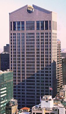
In 1984, a bold, new skyscraper emerged on the Manhattan skyline, which captured everyone’s attention and became the subject of intense controversy. The Chippendale-inspired broken pediment crown of architect Philip Johnson’s AT&T Building shocked the architectural establishment because it so profoundly violated the ruling aesthetic of the day. This bizarre new icon seemed to be cheerfully thumbing its nose at the solemn, modernist glass boxes which surrounded it. Postmodernism was born.
Modernism, with its mantras of “less is more” and “form follows function,” was about pure, abstract geometric form. Its clean lines were stripped of ornamentation, historical reference or symbolism. It offered a standardized, mechanized, futuristic, utopian vision. The serene beauty of the modernist, glass curtain wall-clad office building was best exemplified by post-war structures such as Mies van der Rohe’s Seagram Building and Skidmore, Owings & Merrill’s Lever House.
By contrast, postmodern architecture embraced symbolism and drew upon historical references. Postmodern buildings became signifiers. At their best, the whimsical new icons enlivened skylines and engaged the imagination. At their worst, they became monolithic corporate billboards.
In the early days of the skyscraper, there were plenty of buildings which invoked history. For example, Cass Gilbert’s Woolworth Building suggested a Gothic cathedral. But these buildings often drew upon past styles as a way of avoiding what were, at that time, unresolved aesthetic challenges of building on such a huge scale. The postmodernism of the 1980s and 90s, championed by architects such as Michael Graves, Robert Venturi, and Johnson, played with historical reference, scale and symbolism to create signifiers. Philip Johnson’s turreted PPG Place says “I’m the Houses of Parliament” and Republic Bank Center in Houston says, “I’m a Dutch canal house.” As glossy symbols, these buildings start to seem even better than the real thing, in the same way an advertisement romanticizes a product.
Interestingly, as postmodernism was sweeping architecture in the late twentieth century, similar trends were surfacing in music. Can you hear the postmodern aesthetic in the examples below?
Alfred Schnittke’s Concerto Grosso No. 1
At times, Concerto Grosso No. 1 (1977) by Russian composer Alfred Schnittke (1934-1998) becomes “more Vivaldi than Vivaldi” (listen to the Toccata and the Rondo movements). In this piece, the Baroque Concerto Grosso functions as a signifier in a dark and terrifying drama. Vivaldi-like sequences descend slightly too far and imitation between voices grows into an out of control caricature. Mozart, Beethoven, Tango music and a quote of the Tchaikovsky Violin Concerto (15:57) surface and disappear amid musical breakdown. Hints of Shostakovich emerge in the opening of the Recitativo.
Concerto Grosso No. 1 is filled with voices of lament. Slowly awakening in the first movement, they sometimes shriek out in pain and other times sink into resignation. In the last movement, we hear distant echoes of the Toccata (27:22).
Here is violinist Gidon Kremer’s 1988 recording:
- Preludio. Andante (0:00)
- Toccata. Allegro (5:01)
- Recitativo. Lento (9:27)
- Cadenza. [without tempo indication] (16:22)
- Rondo. Agitato (18:54)
- Postludio. Andante – Allegro – Andante (26:00)
John Adams’ Grand Pianola Music
Grand Pianola Music (1982) started with a dream. John Adams writes:
As with Harmonielehre, which began with a dream of a huge oil tanker rising like a Saturn rocket out of the waters of San Francisco Bay, Grand Pianola Music also started with a dream image in which, while driving down Interstate Route 5, I was approached from behind by two long, gleaming, black stretch limousines. As the vehicles drew up beside me they transformed into the world’s longest Steinway pianos…twenty, maybe even thirty feet long. Screaming down the highway at 90 m.p.h., they gave off volleys of Bb and Eb major arpeggios. I was reminded of walking down the hallways of the San Francisco Conservatory, where I used to teach, hearing the sonic blur of twenty or more pianos playing Chopin, the Emporer Concerto, Hanon, Rachmaninoff, the Maple Leaf Rag and much more.
The majority of Grand Pianola Music is firmly rooted in minimalism. Its opening pulse suddenly emerges, as if the volume has been turned up on something which has always been present. There’s a sense of time moving through the music as it slowly develops, forcing us to become one with the moment. The circular nature of minimalism flows from the isolation and repetition of single chords or progressions. In Four Organs (1970), Steve Reich sustains and elongates a dominant eleventh chord for fifteen minutes. As voices join and drop out we get a changing, kaleidoscopic view of the chord. We anticipate a resolution, but the chord remains suspended in air.
But listen to what happens with the similar, prolonged dominant harmony in the opening of the final movement of Grand Pianola Music (23:01). In a sudden and unexpected move, the chord resolves. The abstract purity of minimalism is shattered and the music takes on postmodern meaning. A melody emerges which suggests Lisztian bravado, Beethoven, and gospel music all blended together. This is the moment where Adams finds the musical equivalent of the AT&T Building’s outrageous Chippendale top. It’s a theme which seems brash and out of place, like the fanciful, arbitrary historical references of a Johnson office tower. It comes out of nowhere, but it’s a voice which demands to be heard.
Grand Pianola Music was so shocking in 1982 that the first performance was met with boos. Adams writes,
True, it was a very shaky performance, and the piece came at the end of a long series of concerts, many of which featured serialist works from the Columbia Princeton school….Grand Pianola Music must have seemed like a smirking truant with a dirty face, in need of a severe spanking.
- Part 1A (fast) (0:00)
- Part 1B (slow)
- “On the Dominant Divide” (fast) (23:01)
Michael Torke’s Ash
In the late 1980s, Michael Torke wrote a series of pieces with titles relating to color. Torke experiences a neurological blurring of the senses, known as synesthesia, in which musical keys and sounds evoke involuntary associations with color.
If you’ve ever heard music in a dream, Ash (1988) may remind you of that experience. This piece is made up of fleeting moments where you might swear you’re listening to the classical orchestration and counterpoint of Beethoven. This is not real Beethoven but a glossy representation of Beethoven. Even “better” than the real thing.
What a splendid post! Interdisciplinary joy. A thousand thanks.